we finished out film last friday after several hours of over time to complete the editing and music. despite mechanical problems with the laptop we were able to complete or film almost entirley as we planned. it is now on disc with the title "Kings Acre". i am pretty happy with the finla product and have few worries about the whole process.
Thursday, 17 April 2008
Sunday, 6 April 2008
further updates
Sorry there is such a gap in entries here. obviously we are currently on easter hols but we have done alot of the editing after having to practically refilm all footage due to lighting problems, it is starting to look pretty good. we are cuently debating sound and will be working very hard this week to get our film perfect to be burned onto disk and completed by friday. i am confident that it will go ok!
Sunday, 9 March 2008
Filming
So this weekend we brought the weeks of planning and preparation together and put it on camera, and I can gladly say that so far things are looking good. Just want to say thanks to Rosie Leathers for allowing us to shoot at her home providing us with a location that I personally felt worked better then I first imagined. We did consider other locations before filming at Rosie’s house. Me and Josh had checked out a rundown cottage in Woolpit and although it looked very good from the outside it was near impossible to film inside. We did think of filming the outside of the cottage then bringing the camera inside of Rosie’s house but the contrast was too great for it look believable.
Although Rosie’s house worked well on the whole, we did however experience minor difficulties. When we went to shoot the corridor scene we realised that the camera dolly was too wide for us to track down smoothly, so we decided to do several stills getting closer to the end each time, since this cuts the scene up we will have to cut in with pictures of the victims provided by josh.
We may have to go back during the week a reshoot a couple of scenes since lighting was a slight problem with both the camera and natural lighting coming through the windows, our final scene may also have to be reshoot but this can easily be done inside of school if it is a problem to shot at Rosie’s.
I feel that overall it was a successful day of filming getting all the provided shots; I also feel we worked well as a group with little to no disagreements, Kat took role of director whilst I filmed the majority of the project with Kat helping out with the opening scene. Josh set up the room and provided us with an excellent final map. We are now looking forward to see how it shows on the Mac and editing the piece.
Saturday, 8 March 2008
Update #3
Just finishing up the items needed to construct the 'victim' map. Printed off headlines and news articals that i've written to accompany the polaroids. Bought pins and string from the shop (99p each) and have a map prepared for the background. Written out a basic idea for some shots to be used during the montage and will be filming later today. Kat has the camera and a pin board for the background and Goring is bringing story boards etc. Will post soon to tell you how filming went.
Monday, 3 March 2008
update
Just a quick update on our progress, our storyboards are finished but i don't think we'll put them on the blog as my art work is shocking! Our narrative has been fine tuned and we are collecting together props; polaroid camera shots of blonde young women, items to assemble the map with.
We have chosen a location; our friends house- not very imagentitive but we wanted somewhere with quite a long corridor in order to track down very slowly towards the room where our mystery pro/antagonist will be assembling the map of "victims". We contemplated shooting it somewhere quite run down, but then decided an ordinary house would be more creepy as it would be soewhere the audience would be able to relate to and "things that can happen behind closed dorrs" is quite a chilling statement, also it won't make our opening seem too horror. Choosing which house to use did not take much research.
Josh has done our Shot list, and James is currently scoring our soundtrack. The camera is booked for this weekend, so hopefully if all goes well we will begin editing on monday! think that is all for now...
Sunday, 24 February 2008
Audience feedback
Apologies as i have only just compiled our audience questionaire feedback!
We produced a questionnaire which we handed out to 9 males and 9 females ranging from the ages of 16-35. As our brief is to produce a thriller suitable for a certificate of 15, it is not only 15 yearolds who would watch such a film, so to have a mixed age group was important to ouraudience feedback. Below i have made some statements from the questionare results, and i have highlighted the things which i think we have tried to encorpoate into our thriller/what the questionnaries have shown to be most popular in a thriller.
Out of the thriller genres; horror, crime, pychological, action and supernatural the male participants preferred to watch action, psychological and crime the most and females preferred psychological, then supernatural/horror then crime/action. It is clear to se here that the most popular thriller genre is pyschological.
90% of male participants like clues in thrillers which is also popular with 100% of female particpants agreeing.
100% of both males and female partcipants like plot twists and extreme camera angles in thrillers.
90% of male partcipants like fast editing with only 1% liking slow instead of fast.
Female partcipants liked fast/fast and slow editing 50/50- indicating an apropriate mix makes for the perfect thriller.
Male partcipants like film noir 50/50 as opposed to female participants preferring it 90/10. indicating film noir is very popular amongst our sample audience.
The male participants were most afraid of spiders, heights, sharks, little girls on swings and dark corners.
The female participants were most afraid of; spiders, darkness, small spaces and being followed. Indicating overall spiders, darkness and "being trapped" scares our sample audience the most.
The favourite thrillers of our male particpants were; usual suspects, seven, vacancy and sin city, where as our females particpants liked;fight club, memento and clock work orange
The general concences of what makes a good thriller by both our male and female participants is a good storyline with planty of twists to keep focus and to keep them "guessing" with a really good ending which explains everything.
Males wanted a thriller opening to have secrecy, action, cliffhangers and montages
Females wanted to see; suspence, mystery, and darkness. This indicates a thriller opening should have lots of suspence/cliffhangers and mystery.
Males wanted characters to be; secretive and have in depth personalities/histories
Females wanted to see; suspence, mystery, and darkness. This indicates a thriller opening should have lots of suspence/cliffhangers and mystery.
Males wanted characters to be; secretive and have in depth personalities/histories
Females wanted characters to have; mystery and suspence, dark pasts, to be secretive "two faced". This indicates characters should be secretive, unpredictable and dark.
Idea for map

This is an example of what we intend our "map" to look like, this example is from the good old memento and the other is from hero's

We would like our map to have this kind of look, as it shows someone has been planing something for a long time with a lot of thought. In our opening the map will depict the antagonists sinister intentions- to stalk/find/kill innocent girls who all look similar. We feel this kind of map will be very creepy and thrilling, especially as it will be constructed during the opening montage by the "killer" who's indentity will be witheld from the audience. Only his reseidence/place of work will be known as we will enter the room where the "killer" is working away at the map through a voyeristic establishing shot,panning through the window, and down to where the room is located within the house!
Monday, 18 February 2008
Update
Just a quick post to let everyone know how it’s going. The three of us sat down in our designated thinking place (the children’s section of the library) today and came up with quite a few good ideas as well as finalising some. We settled on the idea of using a montage scene depicting the creation of a map, pin pointing areas of interest to an unknown character. The scene will open with an establishing shot of a run down building, slowly the camera will track into the building through a window and down a corridor and into a room with a map on the wall. We will then cross cut between the unknown character preparing pictures and information to be put on the map, and the map itself as more and more information appears on it. All of this will be cut quickly to create confusion and there will be close-ups of random pictures. The scene will end with a shot starting as a close-up of the main title of the film (to be decided), which will then slowly zoom-out revealing the completed map. Hopefully this will all be story boarded soon and we’ll be able to post that up some time.
Tuesday, 5 February 2008
Tribulation
Just found this short film, by students at a college given basically the same brief as ours and which in my opinion is just short of looking professional. Despite being just one minuet fifty in length, a good range of shot types are used as well as editing techniques and transitions.
The first shot (a long, establishing shot) is a fairly long take and is well controlled as it pans across to show the area. It is interrupted by about three extremely fast clips of which we can just about identify as scraps of paper with pictures on. This first shot is a nice contrast to the series of quick edits we see toward the end of the clip. I especially enjoy the rapid cuts which link shot together i.e. the knife appearing clean and then with blood on or, the pictures multiplying on the wall. An excellent graphic match is used to link shot together and show the passing of time i.e. the knife spinning and the clock turning. Mostly all the shots are in some dreary colour close to black and white, possibly the scene would have looked better on a whole if black and white was used through out for example, to match the titles. The music (although not scored) is extremely effective and fits the scene really well, creating a spooky atmosphere. Towards the end of the scene the shots begin to move much quicker (the knife spins faster, as do the hands on the clock) meaning that the end is almost like a crescendo, however, instead the scene fades and the title appears. Admittedly, a few shots could have been framed better but this is a small problem considering the rest of the scene.
Monday, 4 February 2008
Memento Opening
Here is the opening from Memento, in my opinion a fantastic triller. What is not realy revealed during this openig scene is the serious messing of chronology and mix of black and white footage with colour sections which tell two different narratives, however these evebtually over lap, creating an amazing thriler twist.
what I particularly like about the opening scene, is the use of time reversal first presented through the tightly frame polaroid photo; and then much more cleraly througout the rest of the scene. Secondly I like the concelament of the man holding the photo's identity; which is continued for quite a period of the film. This is what I believe makes this film so engaging; the amount of enigma codes that are presented in the beggining of the film encourages the viewer to keep watching right to the end, although due to the mixed up narrative they may not have a clue what is really going on!
Elements from this openig that I would like to include in my own opening are;
the use of black and white, a chronologically mixed narrative, audience retardation and the the use of tightly framed POV shots.
Se7en
Se7en (David Fincher, 1995)
‘Se7en’ uses a montage of gloomy and somewhat creepy images during its introduction and opening credits giving little away to its audience. All of the shots we see within the first two minuets are close ups, meaning that we see only what the directory wants us to see and much of the background and surroundings are obscured. The use of close ups also puts emphasis on the objects we are shown, for example: the hands we see which we can only assume belong to antagonist (given the grizzly conditions under which we see them).
The same track is used for the whole of the montage scene, created with a synthesizer it used a basic atonal drone in the background with a number of other tense, strange noises over the top. At certain points throughout the extract the music changes slightly to reflect what we see on screen. For example when the unknown figure is cutting skin from his fingers a screeching noise is used, as if to make the shot even more cringe-worthy. At a certain point just as a line is drawn through a picture of a man the music becomes slightly quicker paced and more sounds are added, the track becomes more chaotic and the audience more disorientated. At the very end there is a single line of lyric, a strange line that possibly hints at the story line ‘You bring me closer to God’.
The titles are all in white, white being a basic colour. The credits are written in a freehand, hand written style font giving a ‘personal’ feel as if it has been written by the person who’s hands we are seeing. The names of the companies as well as the jobs of people (directors etc) are written in a basic block san-serif font in order to look official. Straight cuts are used, though not for usual reasons (for continuity) as they cut very drastically. For example cutting between a close up of a number of unrecognisable metal objects. Unusually, a similar amount of fades to black are used which (usually show passing of time) help to integrate the titles as well as making the audience more bewildered. The name of the film ‘Seven’ is written ‘Se7en’ to give the impression it is a code rather than just a name and causes the audience to wonder. The scene starts in black and white, adding to the confusion. About half way through the scene there is a shot of a photo being developed in red liquid which, given the shots we have seen so far looks like something slightly more sinister. Also, later on in the scene, just as the music begins to pick up, and after a fade to black, the scene changes to colour and basically replays its self in colour.
The scene opens to show the pages of a book turning, later on we see the same book being written in as well as see that it contains pictures of; a pair of hands (which we can link to a shot showing a faceless character cutting hi hands), photographs of various victims killed in various ways and a pair of scissors cutting up new photos to add.
Keeping things back from the audience in order to create a sense of confusion is a convention of the thriller genre along with holding back revealing the main threat or antagonist.
Sunday, 3 February 2008
Bourne Supremacy Opening
I really like the use of this messed up montage as the opening to a thriller. The first minute or so of this clip has a really high pace and mix of fast forwarded and still images which create the sense of confusion presented. I like how it gives small parts of the narrative away, but not enough so that the viewer really understands anything.
The contrast between the vibrant flashes of street lights and the splashes of the rain give a harshness that is quite menacing, and adds to the confusion that both Bourne must be feeling and now the viewer! This is defo a technique I would like to try and use in my own opening; the amount of enigma codes that are produced here within seconds of footage in my opion makes a really clever and interesting thriller.
As for the rest of this clip the camera work and use of silence is very tension building, also the lightenig (although being at night-time), is very filmnoir, and echos the shadows that are the gaps in Bournes memory.
Wednesday, 30 January 2008
Tuesday, 29 January 2008
Handheld Makes Me Cry (Blair Witch)
Personally I find handheld camera work being the most effective way into scaring your audience. It takes P.O.V shots and makes them incredibly creepy. As an audience we are still very limited with what we see and since the camera is far more unsteady it really gives you the sense that you're the one behind the camera and that you're far more involved, making the whole cinematic experience more realistic and in effect frightening.
Blair Witch Project (1999) is most famous for its documentary style of filming with it almost entirely being filmed with handheld cameras. I find it one of the most scariest films I've watched yet through out it we are never shown any gore, violence, or witches, believe it or not. This may also be the case for many other thrillers yet if they don't depend on visuals to create tension music takes over. Again, there is no sound track of any kind with the only aural elements in the film being conversation between the student film makers. Handheld camera work is the reason in why this film is so scary and such a success, tension is incredibly high throughout the film as you really find yourself believing you are stuck in the forest with the other students desperately wanting to find your way out.
The reason I looked at Blair Witch is that it was both incredibly cheap to make and a great success. Handheld camera work can at times look unprofessional if used for the wrong genre but i feel we can take the disadvantage of us having basic equipment and a very low budget and use it to our advantage, hopefull making a truly frightening thriller opening.
Monday, 28 January 2008
top 10 thrillers according to IGN
1. North By Northwest
2. Chinatown
3. Rear Window
4. Psycho
5. Silence of the Lambs
6. Manchurian Candidate
7. Night of the Hunter
8. Seven
9. Vertigo
10. Sixth Sense
2. Chinatown
3. Rear Window
4. Psycho
5. Silence of the Lambs
6. Manchurian Candidate
7. Night of the Hunter
8. Seven
9. Vertigo
10. Sixth Sense
"Master of Suspense"
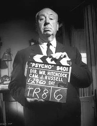
Alfred Hitchcock (August 13,1899 - April 29,1980)
The most successful thriller director. Hitchcock has created some of the most iconic, influencial and chilling films of all time, Psycho, The Birds and Vertigo are just a few from his legendary library.
Want to know more? Click on link below
Subscribe to:
Posts (Atom)